
UX-UI WEB Design
B2B systems often share similar challenges: complex workflows, multiple roles and permissions, and information overload. In these three B2B design projects, I applied system thinking, business logic, and user empathy to turn complexity into clarity:
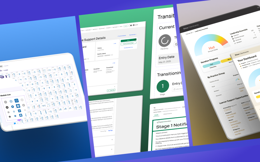
• Project 1: Say Yeah’s Shine Performance Dashboards — Designing role-based dashboards that improved clarity, adoption, and training efficiency →
• Project 2: ApplyToEducation Attendance Support — Streamlining complex HR workflows into a centralized attendance platform →
• Project 3: GWSK Design System — Establishing a scalable foundation for design and development consistency →
Through these projects, I focused on scaling workflows, improving usability, and driving adoption in high-stakes B2B environments.
01
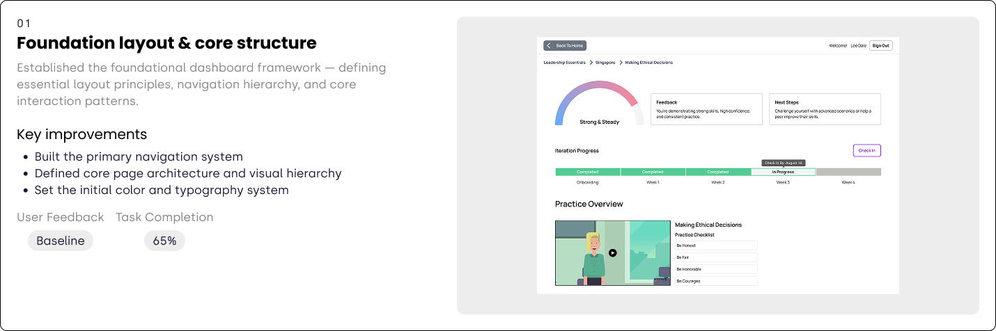
Shine is an AI-driven learning and performance platform that helps organizations accelerate skill development. One of the key challenges was providing role-based dashboards where each group could access critical information at a glance. My responsibility was to design solutions that lowered training and support costs while improving overall adoption.
Building on stakeholder interviews conducted by the PM, I refined the information architecture and designed new dashboards tailored to trainers and learners: trainers required visibility across multiple cohorts, regions and timely access to support opportunities, while learners needed a clear view of their progress.
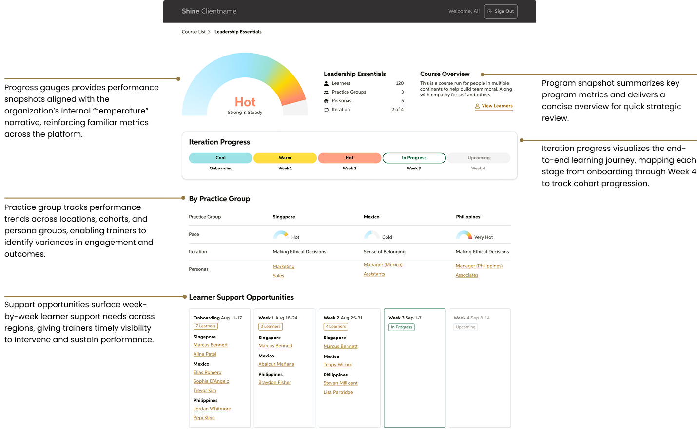
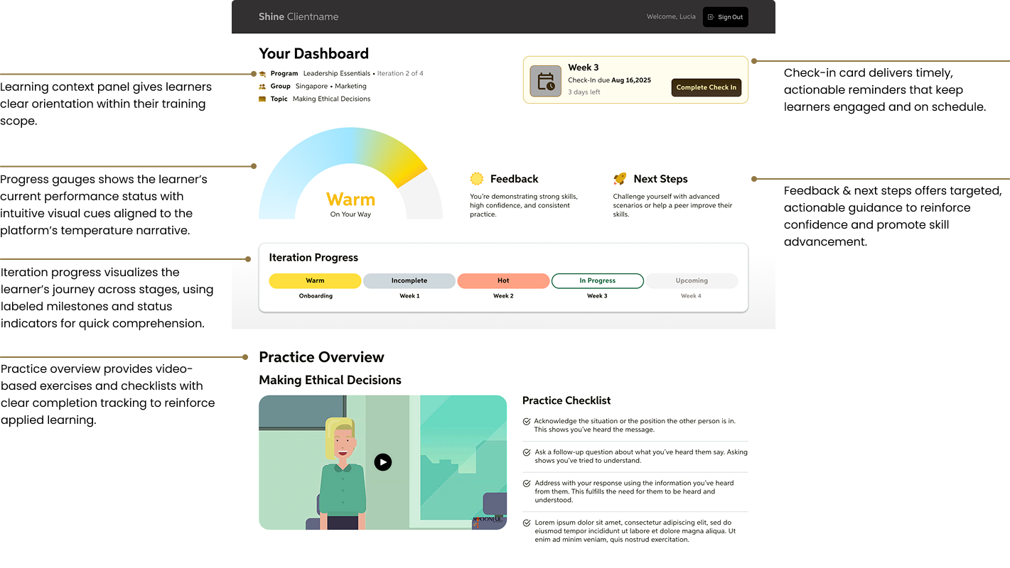
Through multiple iterations, I refined the dashboard layouts to improve scannability and visual hierarchy. Each iteration focused on optimizing information density, color use, and labeling to reduce cognitive load and improve quick comprehension across roles.
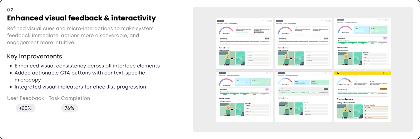
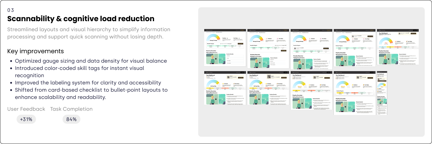
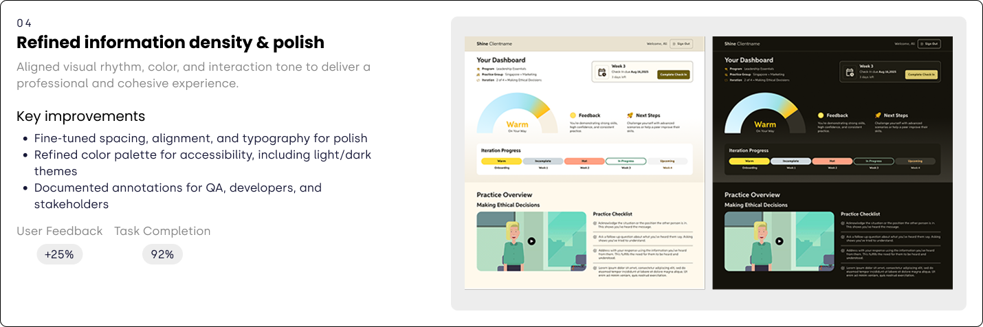
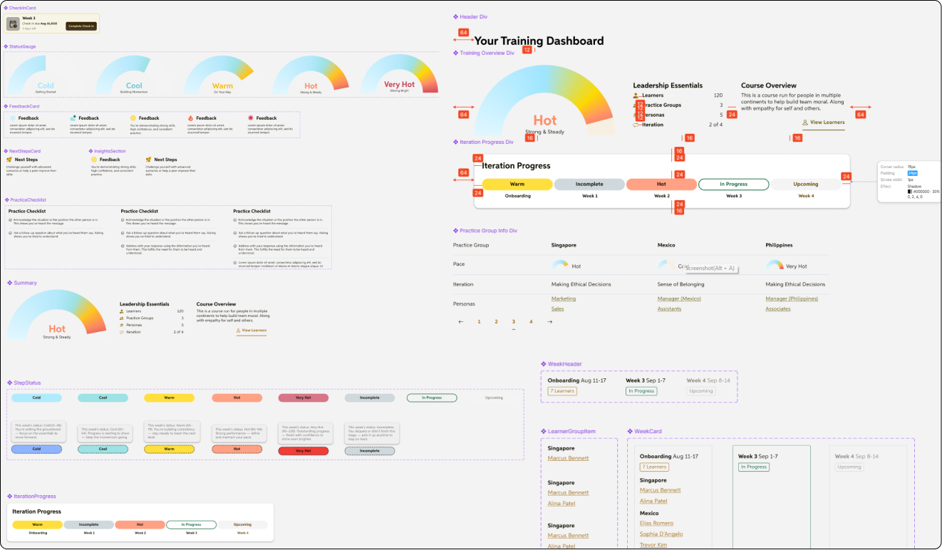
To ensure scalability and consistency, I developed a library of reusable components—such as check-in cards, progress gauges, and feedback modules—assembled into card-based layouts that support both dark and light modes. Accessibility was built in through WCAG-compliant color contrast, icon–label pairings, and clear status indicators.
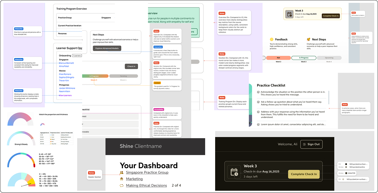
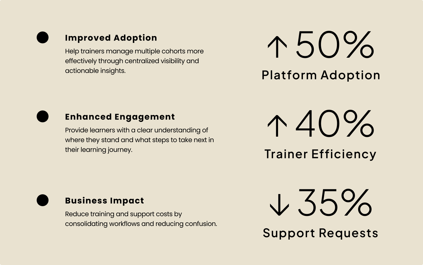
The new dashboards improved operational efficiency and adoption across roles. Trainers reduced time managing cohorts and acted proactively on insights, while learners gained clearer guidance and accountability. These outcomes not only enhanced usability and engagement but also contributed to securing a new client contract for the platform.
02
ApplyToEducation, serving 98% of Canadian school boards, sought to replace fragmented Excel workflows with a unified attendance system. Administrators struggled to manage scattered records and complex processes. The new system aimed to centralize attendance tracking, strengthen compliance, and make decision-making more straightforward.
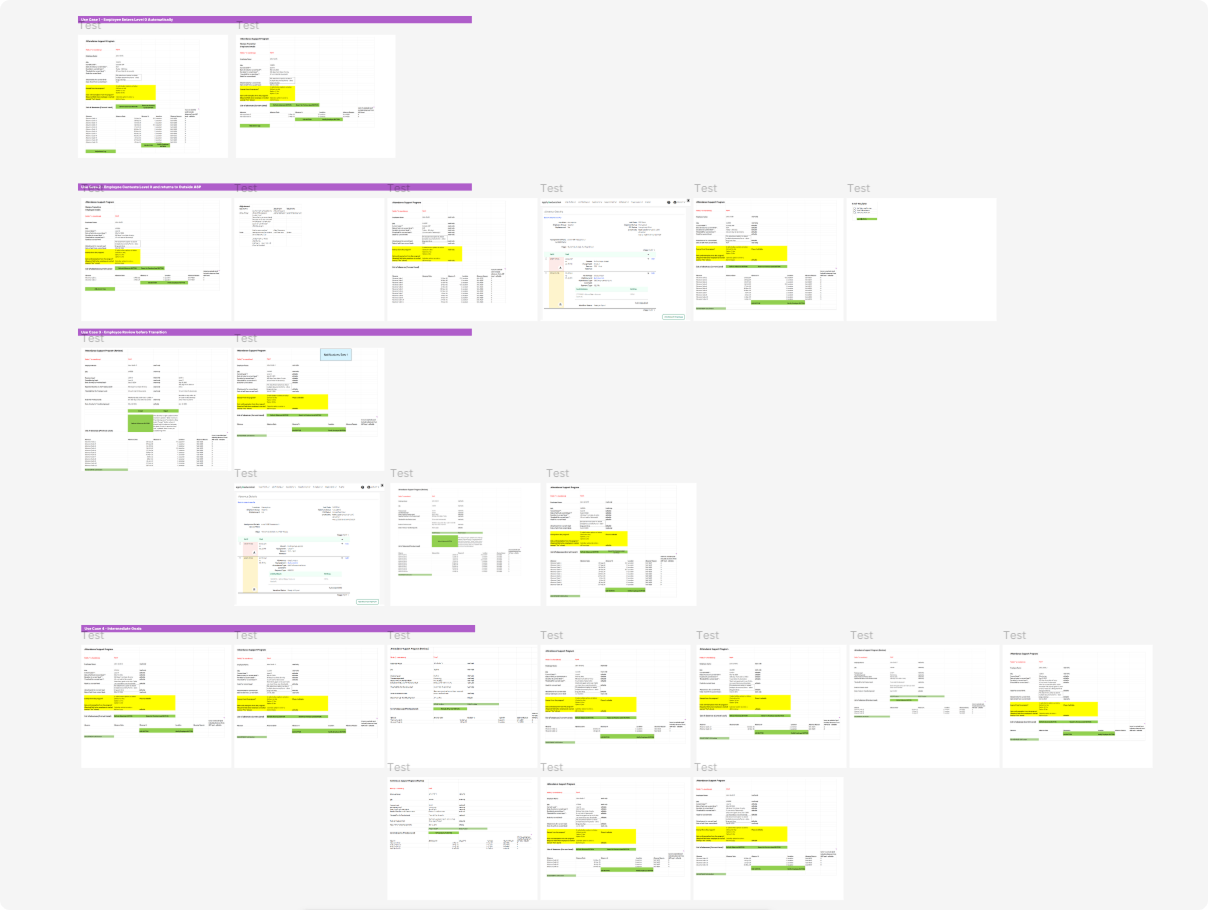
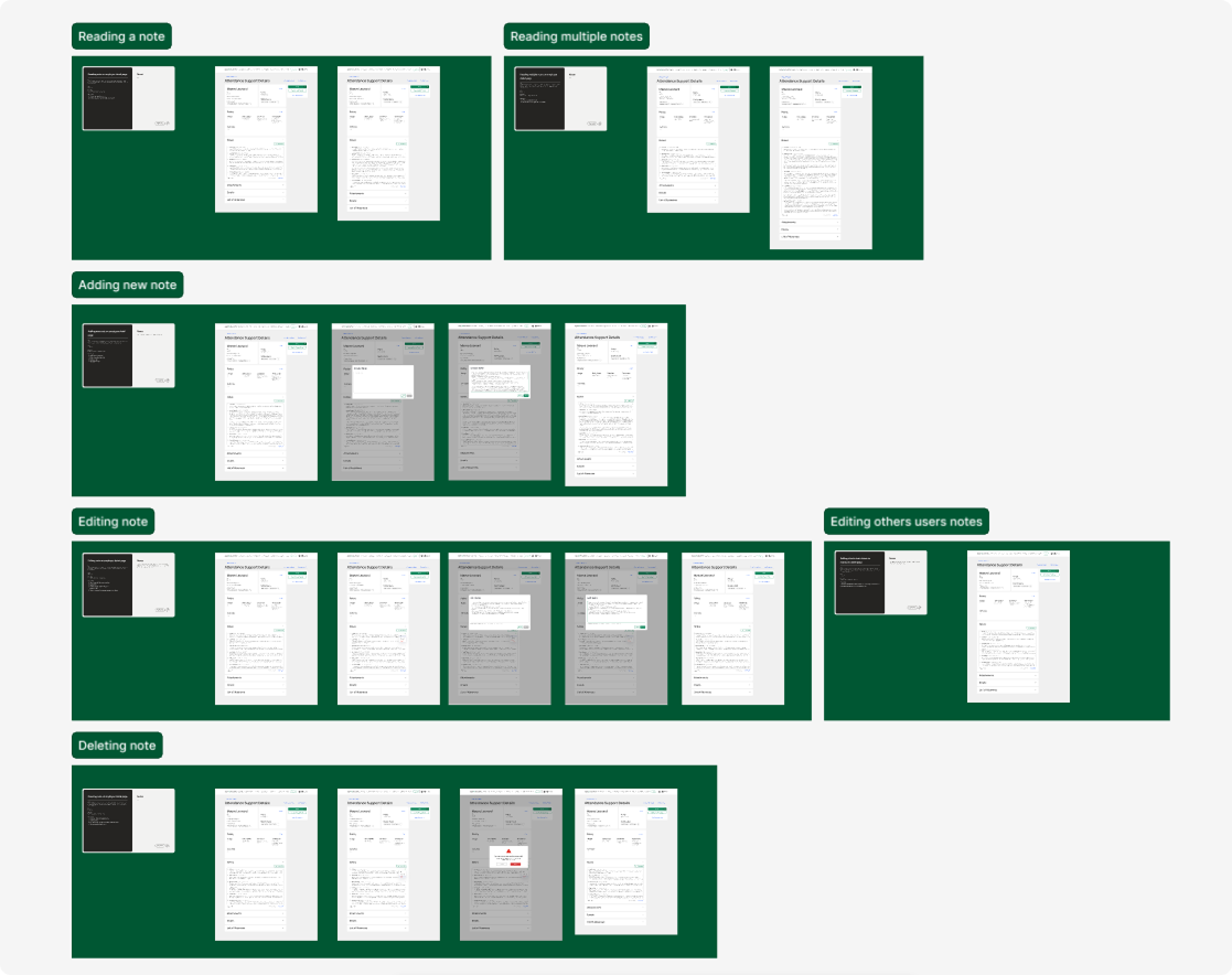
While the PM conducted stakeholder interviews and mapped current journeys, I focused on designing the solution through strategic, UX execution, and systemic delivery lenses. Together, we transformed fragmented workflows into a centralized hub for administrators — enabling them to track cases, document notes, attach reports, and visualize attendance trends in real time — while defining guided interactions grounded in user stories and establishing reusable layouts and components to support scalable MVP delivery.
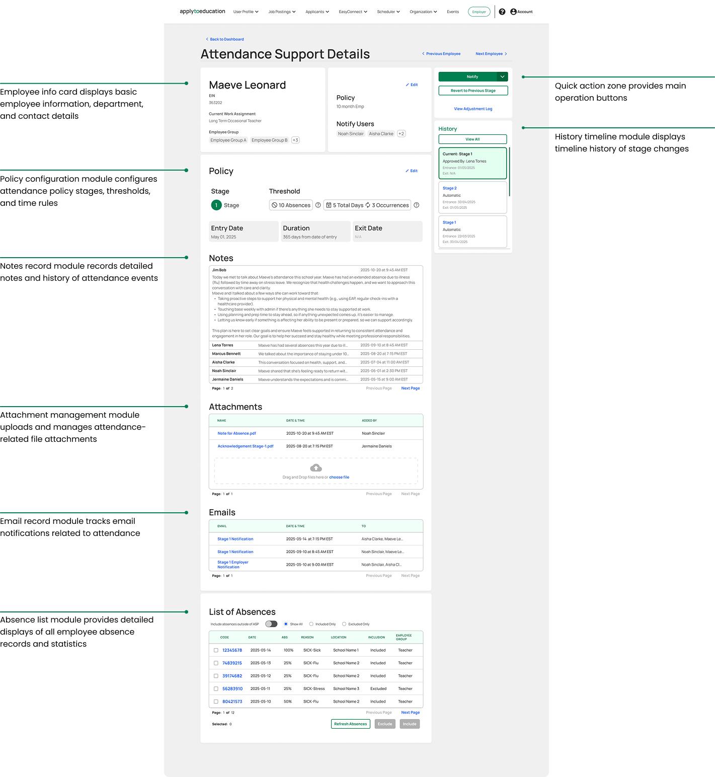
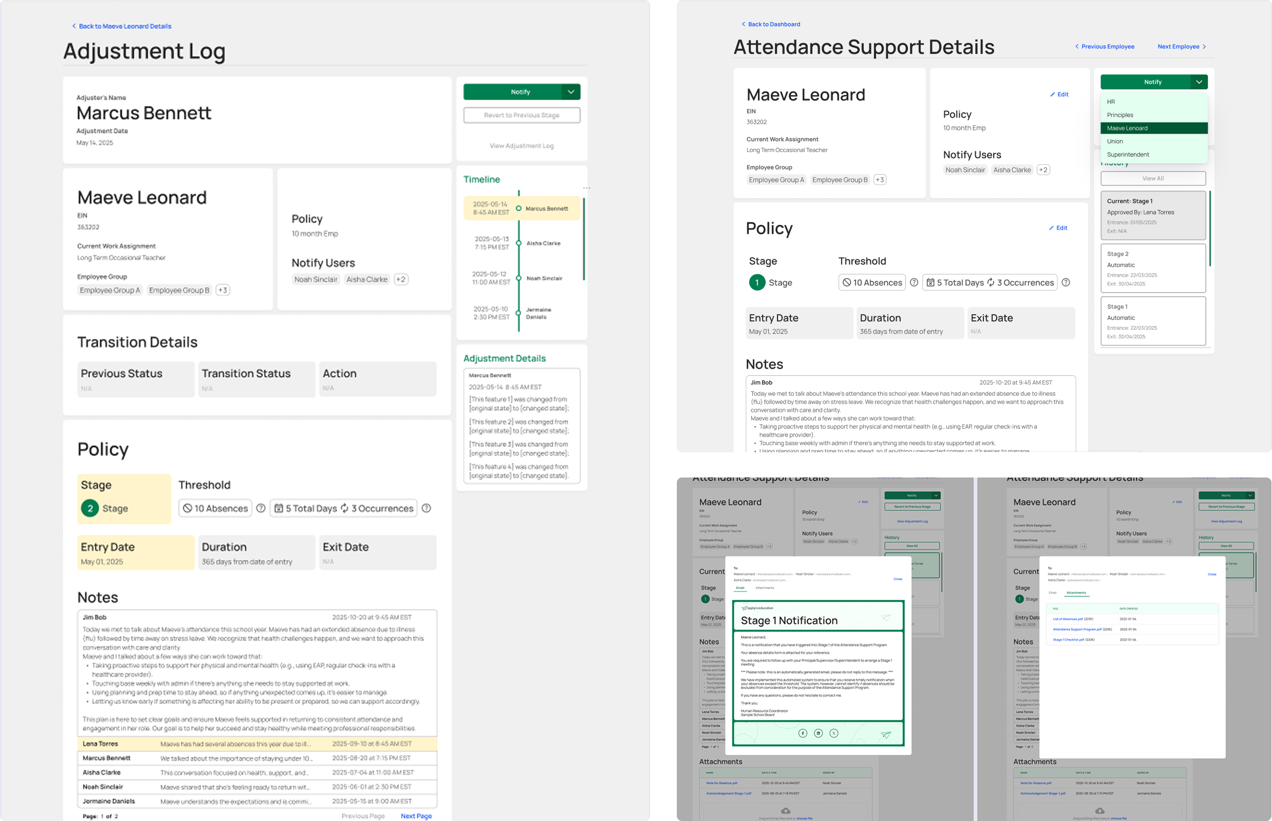
The new administrative hub enables administrators to manage attendance workflows end-to-end, reducing task completion times by 20% and improving overall productivity. Internally, the design team’s involvement improved clarity and alignment across teams, helping stakeholders anticipate downstream effects earlier in the process. This project demonstrated how design can directly influence operations — transforming a fragmented process into a transparent, data-informed system that supports proactive planning and measurable efficiency gains.
03
When GWSK Studio was founded, the team had no unified design language or shared component library. Each project operated with its own styles, typography, and interaction patterns — leading to more design efforts and slower development cycles. The challenge was to build a scalable design system from the ground up that could define GWSK’s brand language, improve team efficiency, and enable consistent design quality across all client projects.
To design a system tailored for enterprise-level products, I audited leading design frameworks including Material Design, IBM Carbon, Ant Design, and TailwindCSS. Through this research, I identified core patterns that define B2B and data-driven interfaces—information-dense components such as tables, filters, and forms; frequent task-oriented operations like bulk actions, toolbars, and notifications; and complex information hierarchies with multi-level navigation and layouts. Drawing from these principles, I began shaping the foundation of the studio’s first cohesive design system.

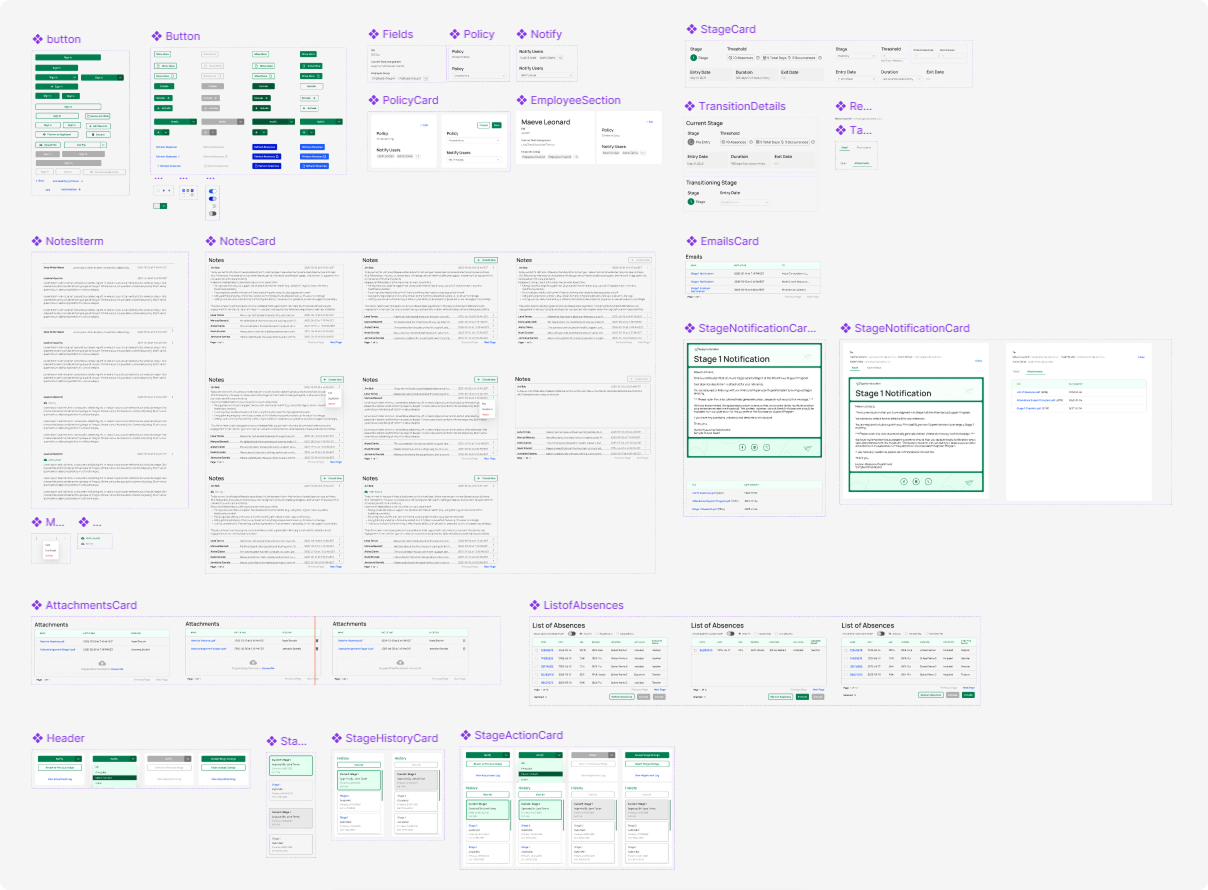
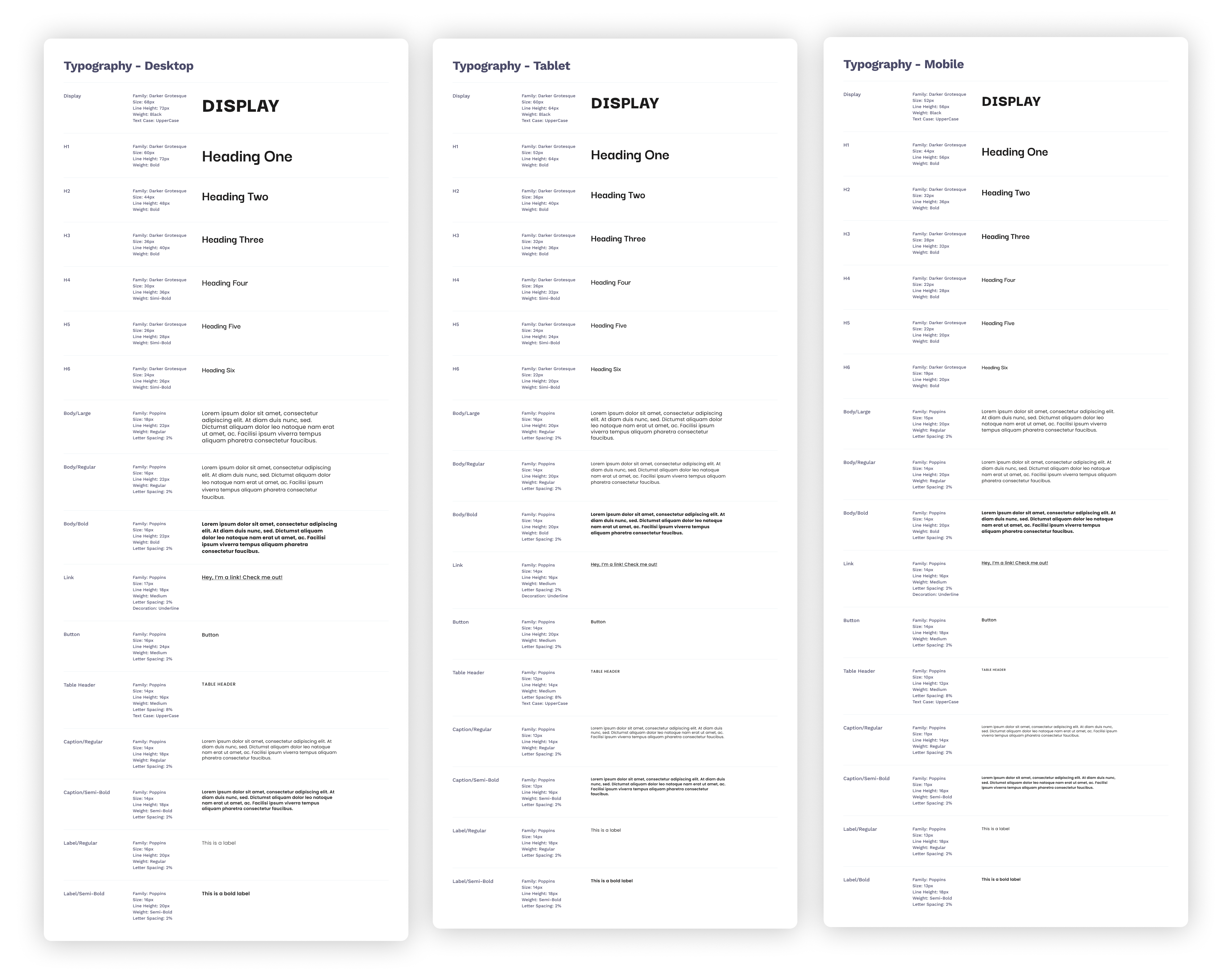
I defined GWSK’s design foundations and tokens—covering color, typography, spacing, elevation, and motion. The system followed Atomic Design principles, ensuring modularity, scalability, and design–development alignment.
System Architecture
• Foundations — Tokens for color, type, spacing, elevation
• Atoms & Molecules — Core UI elements such as buttons, icons, inputs
• Organisms & Templates — Reusable page-level patterns for forms, tables, and dashboards
Through a token-driven design library, the team achieved consistent, brand-aligned interfaces and faster, more reliable design handoffs.
The new design system transformed GWSK Studio’s workflow from project-based design to a system-driven approach. It not only improved cross-team alignment but also strengthened the studio’s positioning as a scalable design partner for enterprise clients. The system continues to evolve as a long-term IP asset, supporting brand growth and operational efficiency.
04
Designing for B2B taught me that clarity doesn’t come from removing complexity, but from structuring it. Building coherent systems that align workflows, business logic, and user roles turns messy operations into scalable clarity.
Through developing the design system, role-based dashboards, and cross-page interactions, I learned that strong foundations—consistent components, clear hierarchies, and reusable patterns—enable faster iteration and long-term product integrity.
Collaborating with Product Managers, Developers, QA, and diverse users taught me that true empathy in design means delivering measurable outcomes—clarity, efficiency, and accessibility for every role.